Svelte Tricks #1 - How to Comment a Component and its props
Published
I’ve been working on what is quickly becoming a sizable svelte app recently. As the size grew, I caught myself wondering if there was a way to actually comment components and expose in VS Code the various props they require.
Turns out, you can. And it doesn’t even require any sort of a setup!
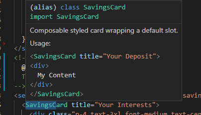
Here’s how it looks like for a SavingsCard.svelte component. (Simplified)
<script lang="ts">export let title;
</script>

<!--
  @component
  Composable styled card wrapping a default slot.

  Usage:
    ```tsx
  <SavingsCard title="Your Deposit">
    <div>
      I deposited 34€
    </div>
  </SavingsCard>
—>
Svelte Tricks #1 - How to Comment a Component and its props
And here’s how it looks like:
See you next time for a new trick.